
Intro (Top)
Case Study
Learn While Practicing
Investing
Concept piece for the Google UX/UI Certificate Program.
MY ROLE: Everything
Goal Statement
Goal Statement
Targeting Non-Professional Investors
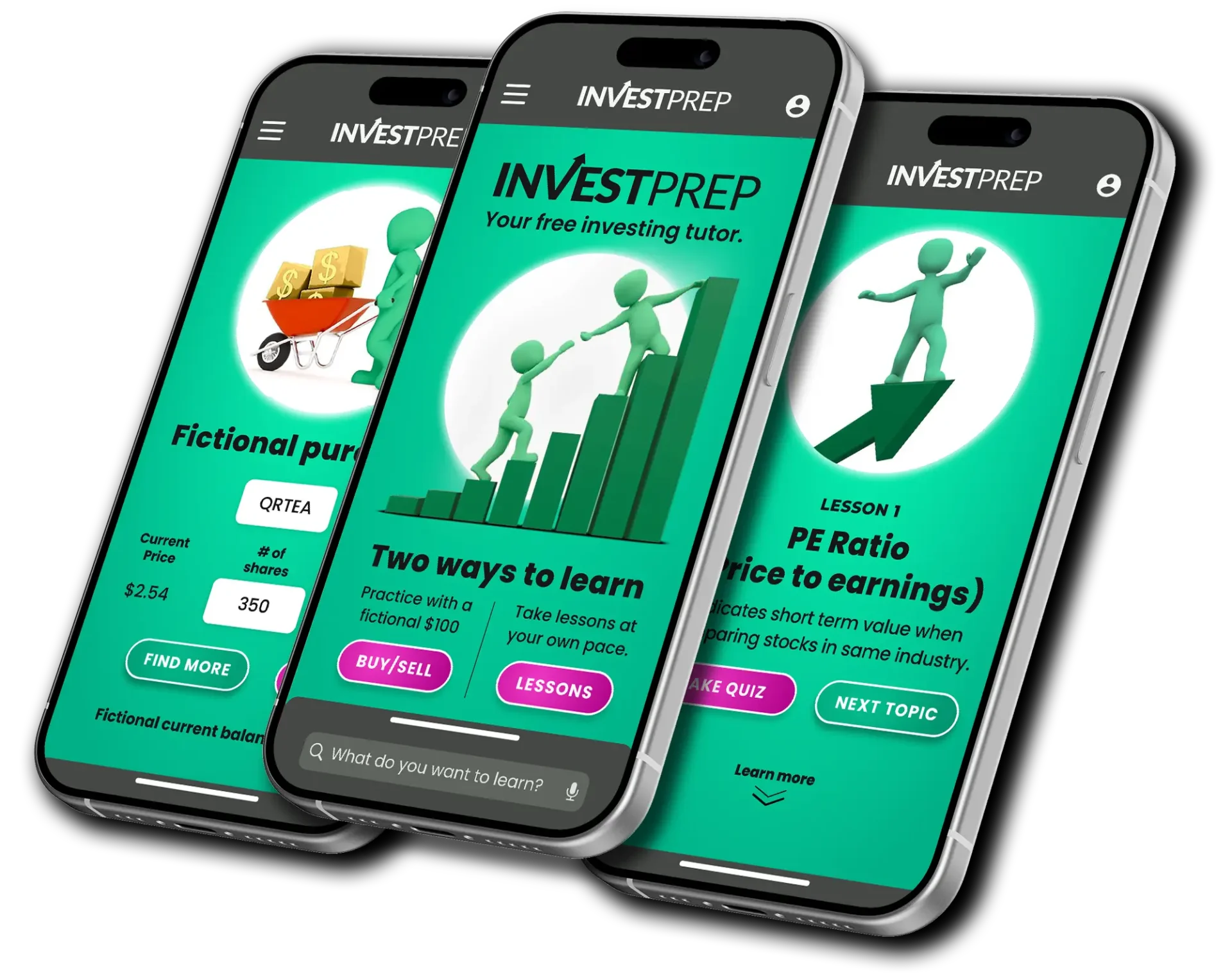
The Investo web site and app will let users learn and simulate buying and selling stocks which will help non-professional investors by letting users take quizzes and practice with a fictional budget. We will measure effectiveness by logs analysis.

Competitive Audit
Competitive Audit
Researching Trading Tutorials
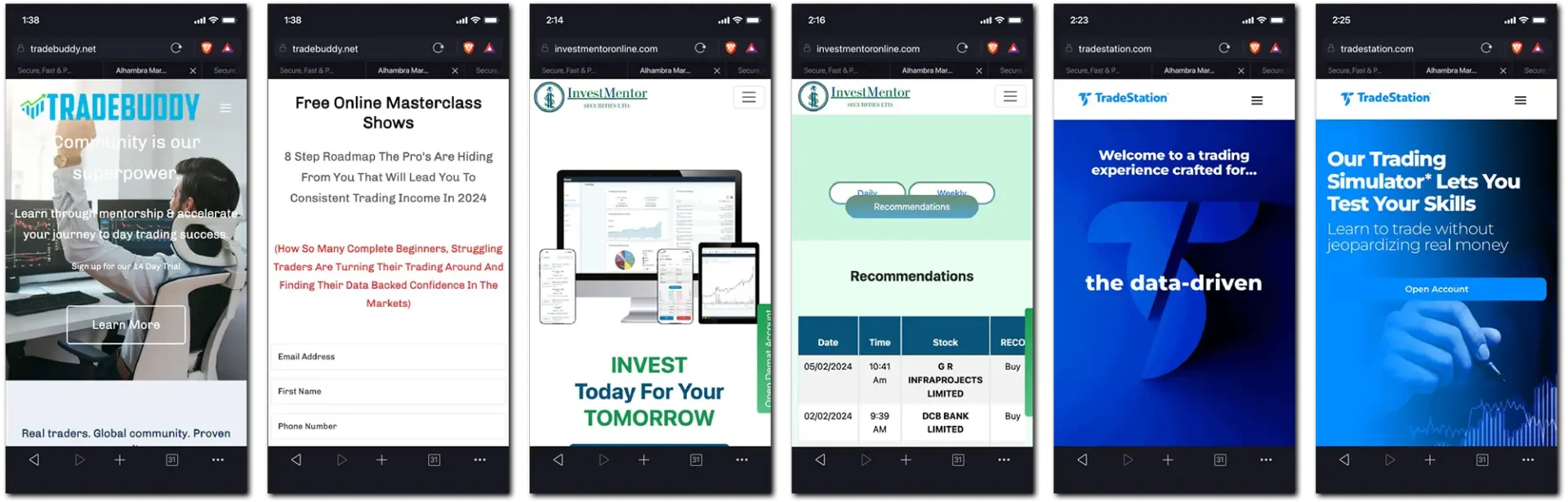



Must enroll to see samples.


Brainstorming
Brainstorming
Immersing in Subject Matter
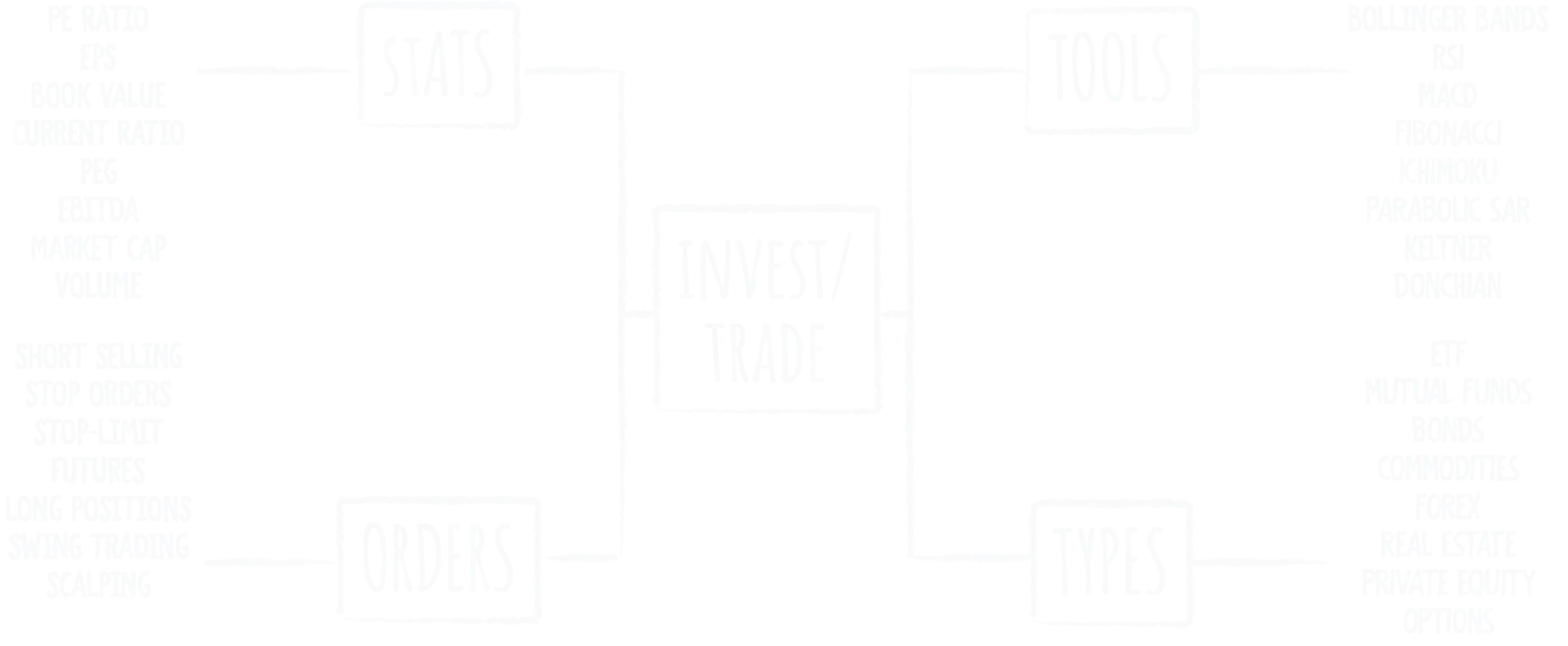
Building upon the competitive research by getting to know all about investing and trading terminology and developing a mood board to help inspire visuals.
Empathize
Empathize
Persona's User Journeys
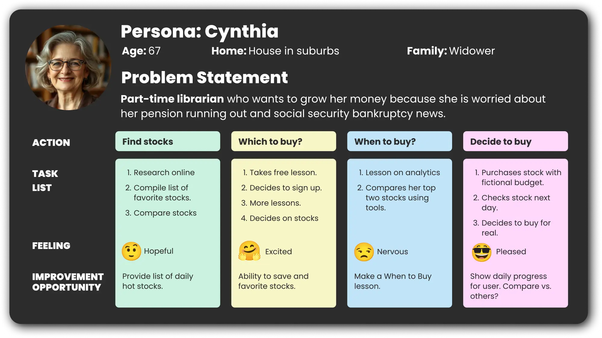
Based on three different personas, the choices and paths were followed necessary to solve each user’s problems.
Page Narratives
Page Narratives
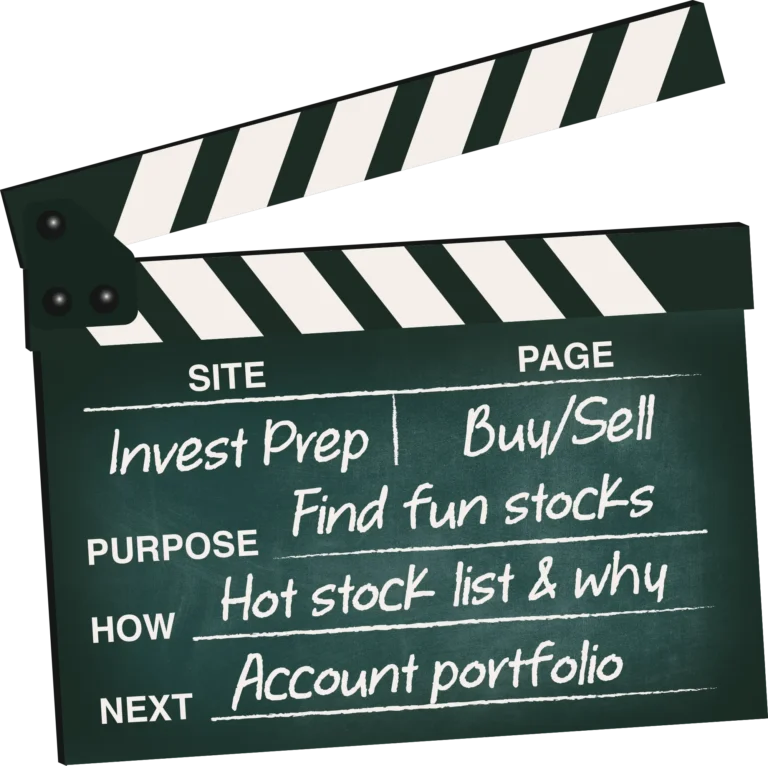
Aligning Content to Site's Goals
Each proposed page is aligned to the site’s purpose and how it will satisfy the users, as well as where the user is directed next.
Site Map
Site Map
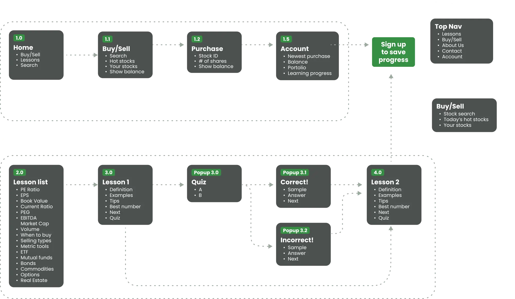
User Flows
A site map is organized after brainstorming sections and categories. Then flows are created to satisfy the users’ needs.
Ideation
Ideation
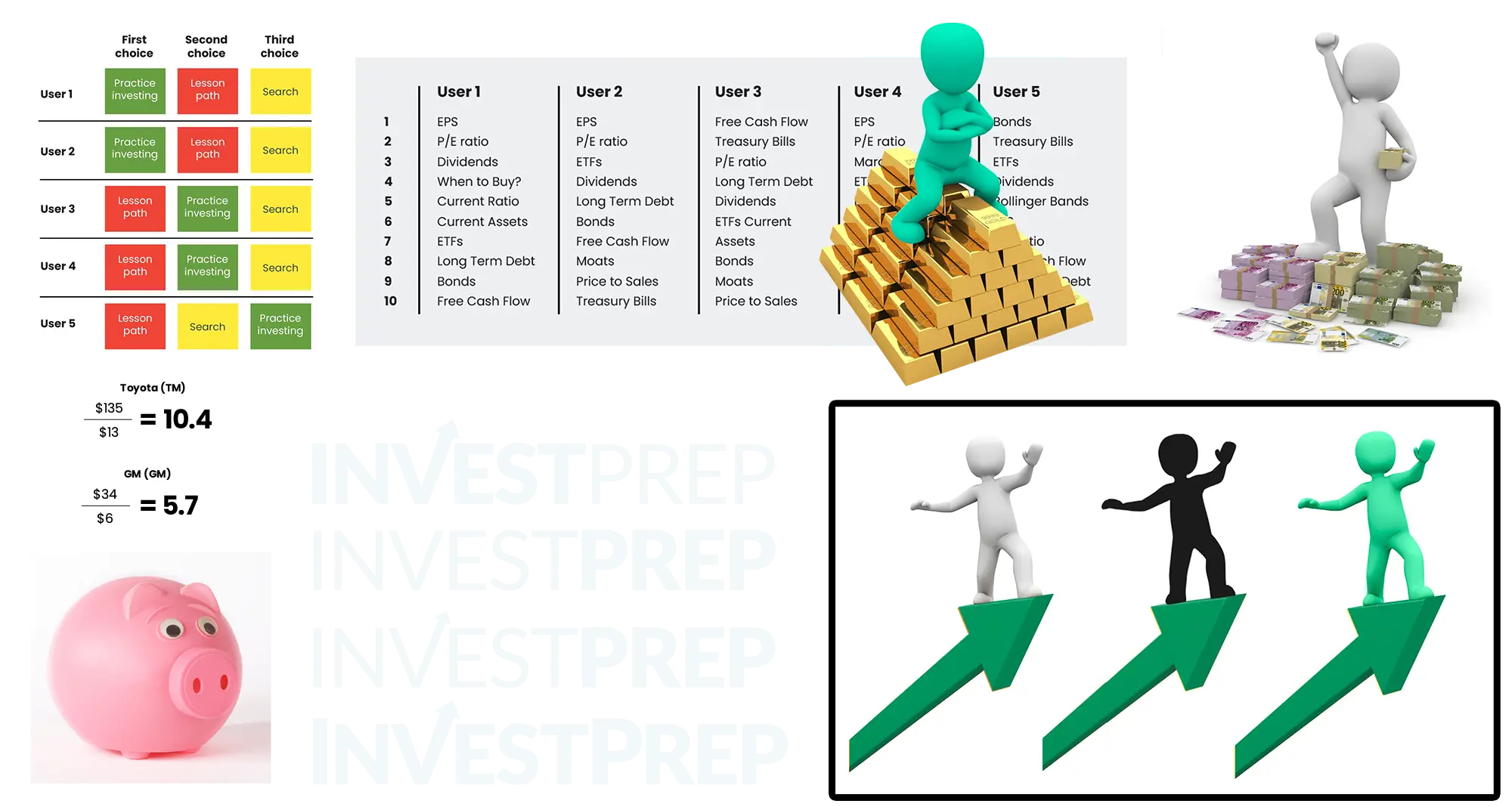
Exploring Visual Solutions
Possible art assets are compiled that could help inspire sketches and wireframes. Logo and hero options are tested.
Strategic Plan
Strategic Plan
Plotting the Moves Ahead
Key research and ideas for the future app are organized in order to get the client’s feedback. Results and proposals from empathizing with the user, defining the problem and ideating concepts are shown to the client for approval prior to the design phase.

Wireframes
Wireframes
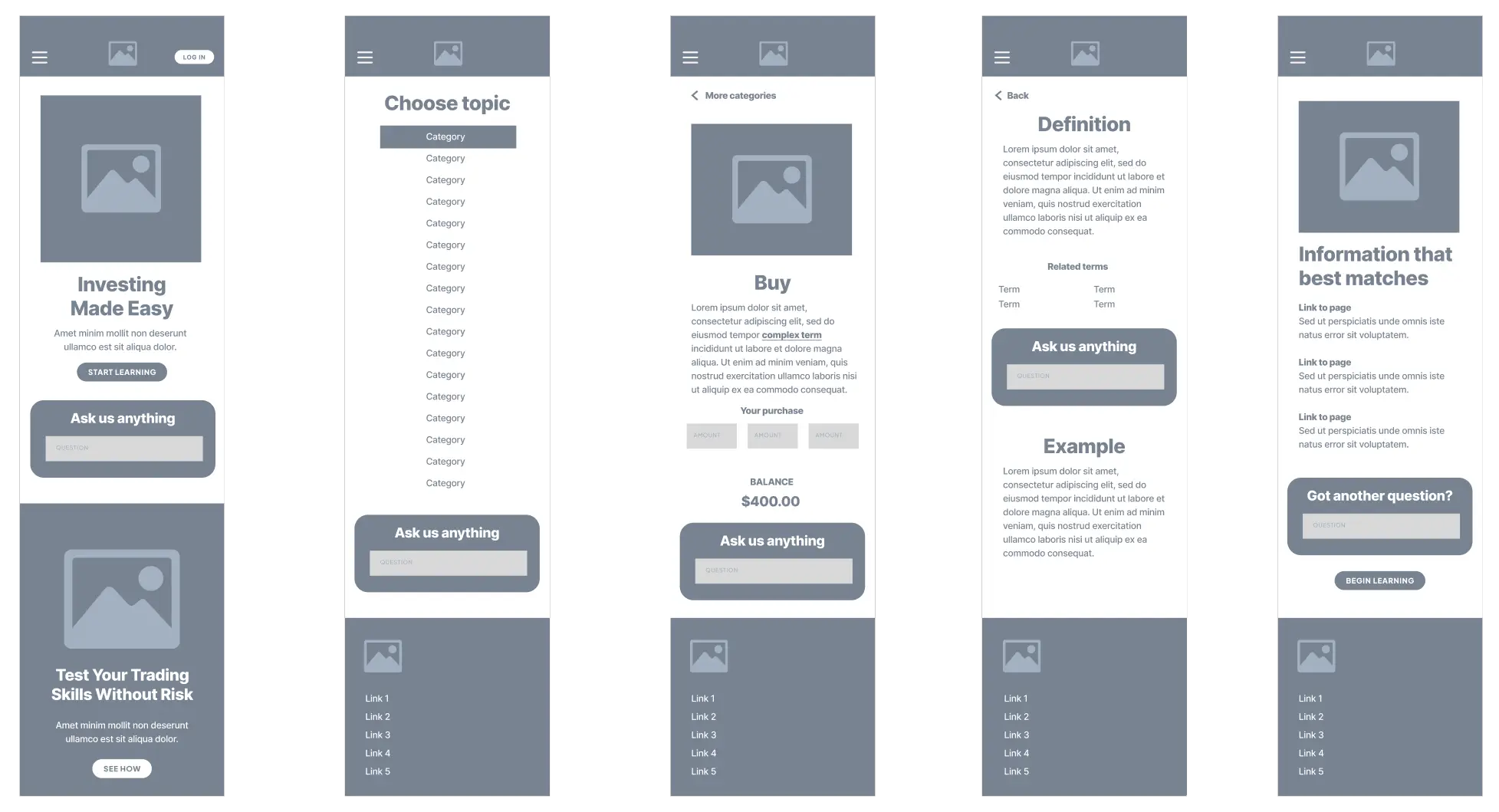
Key Pages Sketched Out
Before wireframing the entire site, key pages are designed in low resolution to decide what components are needed to create a working style sheet and design system. Pages to complete specific user tasks are connected to assist with a usability study.
Style Guide
Style Guide
Organizing a Design System
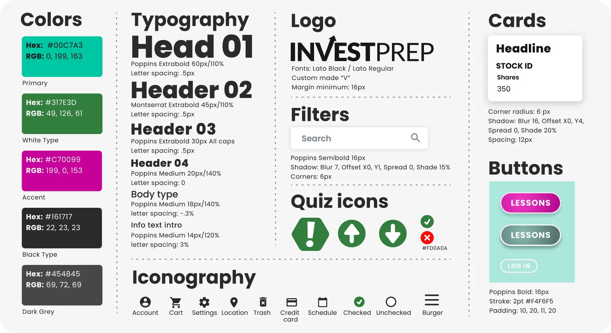
Branding, typography, icons, colors and more and gathered into a useful Style Guide. Individual UI elements are further organized into useful components like cards, buttons and labels which are further packaged into modules and templates for a Pattern Library.
Usabiliity Study
Usability Study
Responding to User Feedback
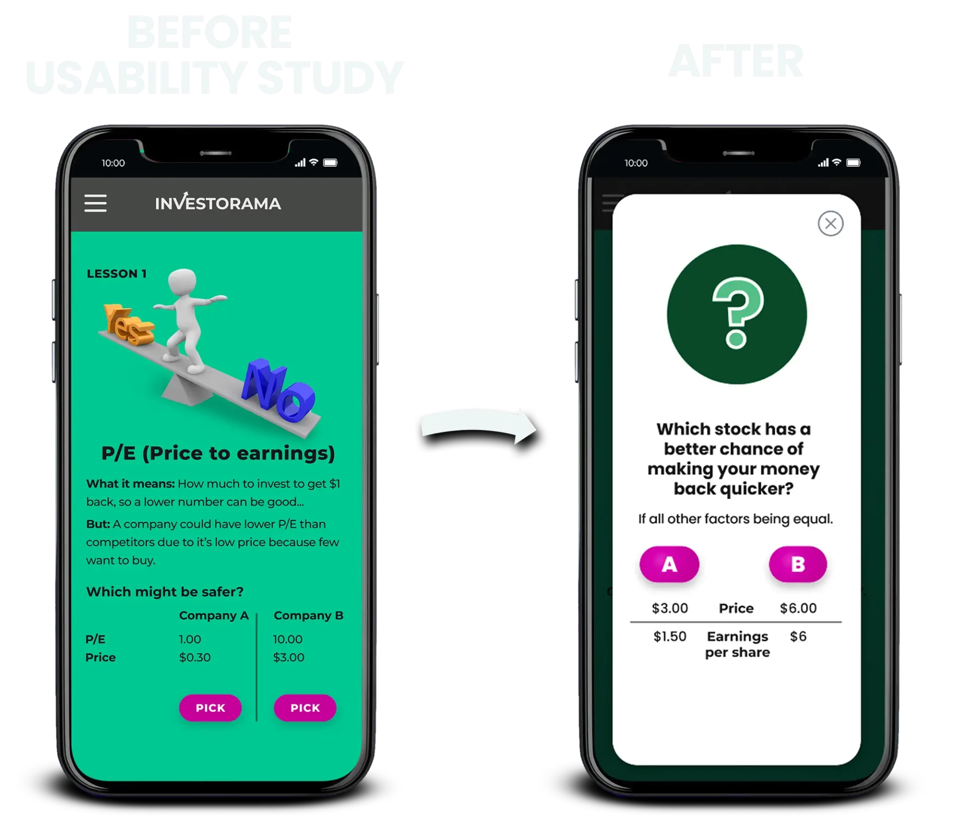
Users preferred a funner test-taking experience, so I did some research and incorporated some animated Lotties, with a crisper, cleaner popup quiz style. The quizzes are not mandatory to continue learning, but are presented as helpful to the user.
Accessibility
Accessibility
Ensuring Readability
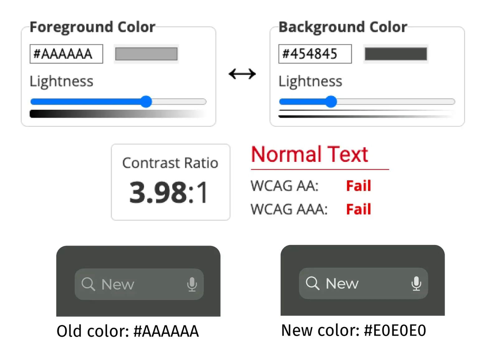
Visual color choices and text sizes are checked with online accessibility tools to make sure there is proper contrast and text size for the visually impaired. After testing, the grey typography used in the search bar needed more contrast.
Prototypes
Prototypes
High Fidelity Time
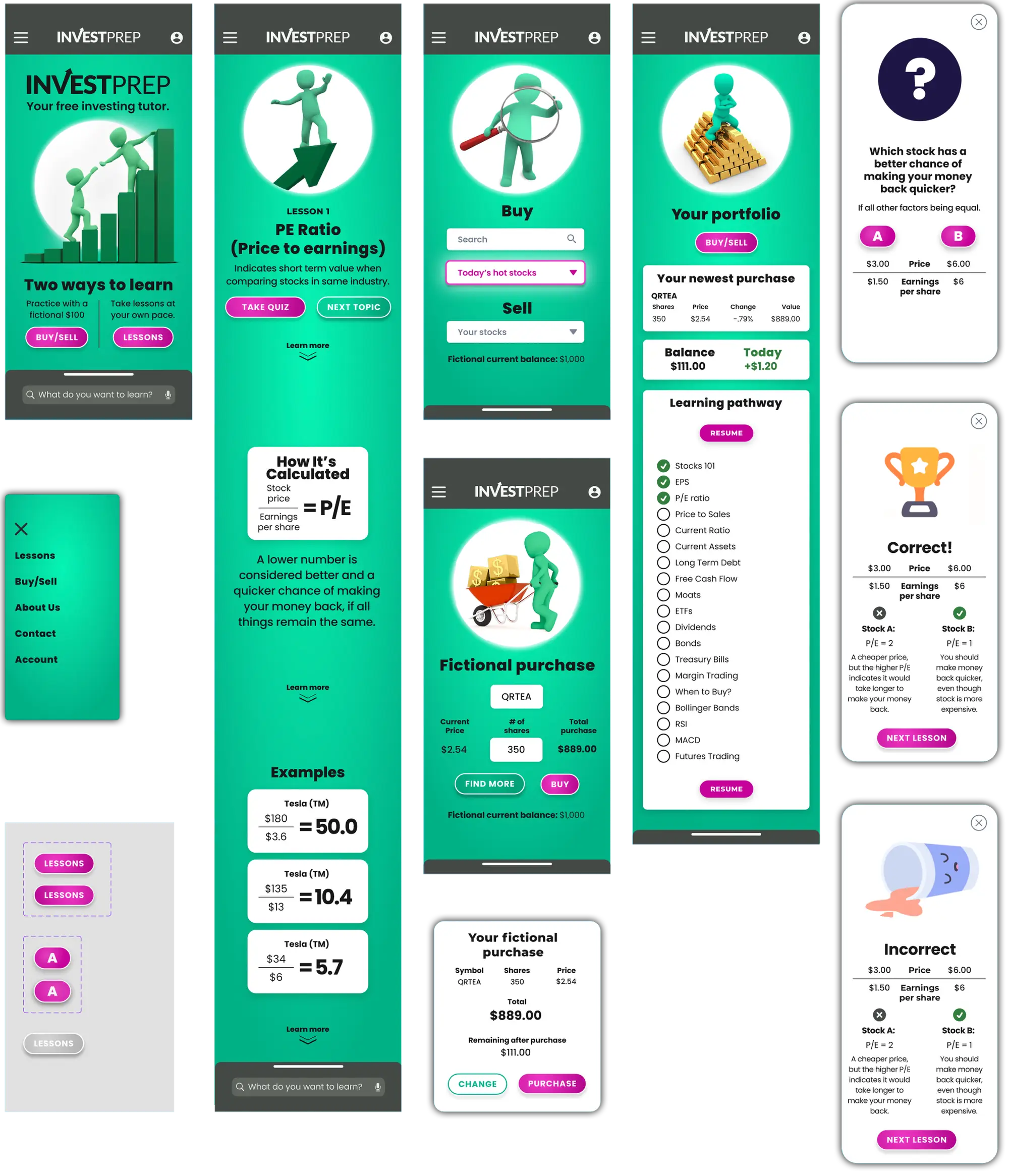
The design system is applied to the wireframes and pages are connected into working user flows.
Tablet and Desktop
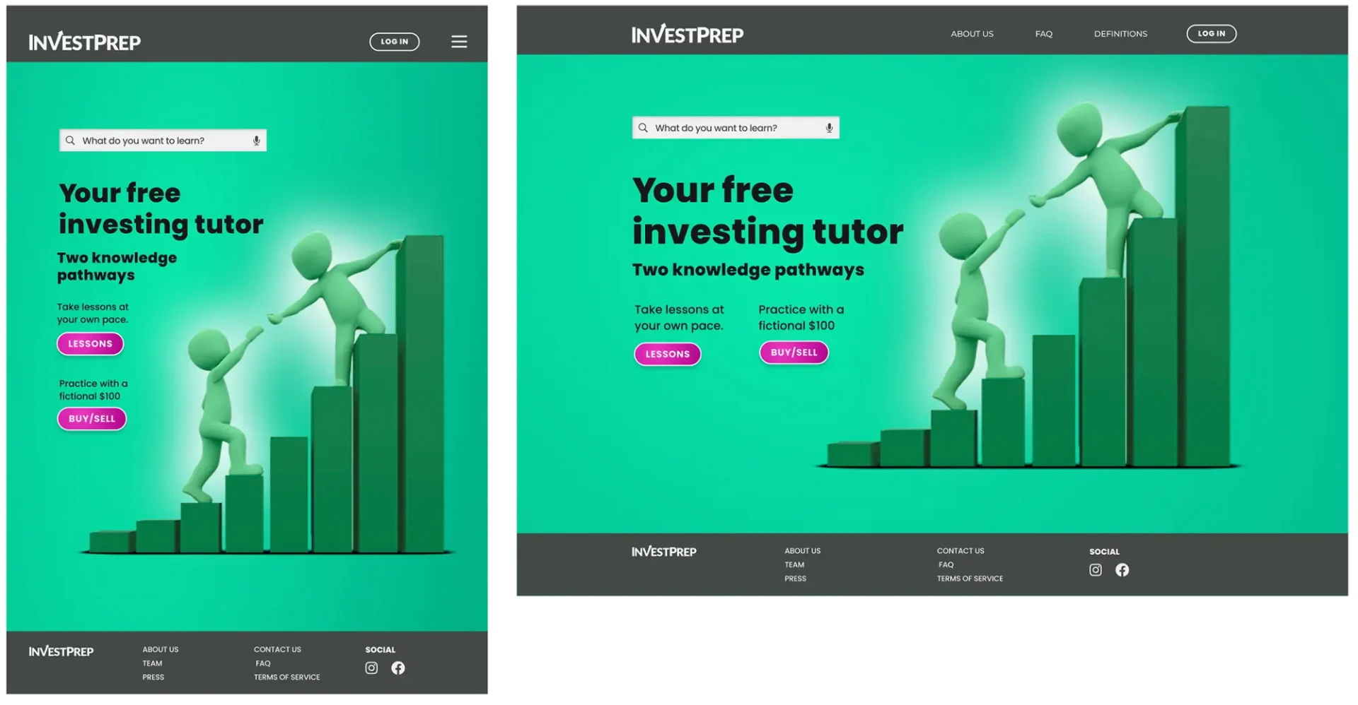 CLICKABLE PROTOTYPE
Conclusion
Conclusion
Experience Gained
and Next Steps
The project helped me improve on more tools in Figma, allowing for stationary backgrounds, better popup interactivity, search box triggers and useage of Lotties. Adding lessons and quizzes would be next on the agenda, since I have a good amount of unused art compiled while building. I could enhance the clickable prototype by simulating input interactivity during the buy and sell process.